오랜만에 새로워진 웹개발종합반 강의를 들었다.
이전에 들었던 것과 비슷하게 html의 태그들을 알려주고, css를 사용하는 법을 알려주었다.
결국엔 display: flex를 마주했다.
한창 코딩을 할 때에도 이건가? 이건가? 하면서 헤맸던 속성이지만 이젠 떨쳐내려한다.
display : flex;
<!DOCTYPE html>
<html lang="en">
    <head>
        <meta charset="UTF-8" />
        <meta name="viewport" content="width=device-width, initial-scale=1.0" />
        <title>Document</title>
        <style>
            .wrap {
                padding: 10px;
                background-color: gray;
                display: flex;
            }
            .wrap > div {
                width: 100px;
                height: 100px;
                color: black;
                font-weight: bold;
                font-size: large;
                text-align: center;
            }
        </style>
    </head>
    <body>
        <div class="wrap">
            <div style="background-color: red">가나다라</div>
            <div style="background-color: green">마바사아</div>
            <div style="background-color: blue; color: white">자차카</div>
            <div style="background-color: yellow">타파하</div>
        </div>
    </body>
</html>
이렇게 코드를 작성했다고 쳐보자. 그렇다면 화면은 아래와 같을 것이다.
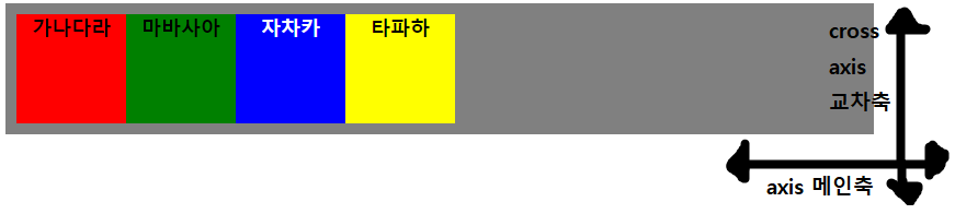
wrap 내부의 div의 height는 틀의 최대값을 가지게 되고, width는 미리 지정해준 값이나 내부에 들어있는 요소에 딱 맞게 적용된다.
flex-direction: ~~;
flex-direction은 내부 요소들이 배치되는 축의 방향을 결정하는 속성이다.
메인축을 기준으로하는지? 교차축을 기준으로 하는지?
각 축에서 어디부터 아이템들을 순서대로 배치 할 것인지? 를 결정하는 속성이다.
여기엔 row, row-reverse, column, column-reverse가 있다.


각 속성마다 방향을 먼저 결정하고, 정방향/역방향으로 시작할지를 결정한다.
flex-wrap: ~~;
.wrap {
    padding: 10px;
    background-color: lightblue;
    display: flex;
    flex-wrap: nowrap;
    width: 350px;
}
.wrap > div {
    width: 100px;
    height: 100px;
    color: black;
    font-weight: bold;
    font-size: large;
    text-align: center;
}
위 코드에서 각 요소들은 100px이지만, 감싸는 wrap은 350px이라고 해보자. 이상태는 어떻게 될까?

flex-wrap이 nowrap이 기본 지정속성이다.
nowrap은 내용물을 담지 못할 때 감싸는 width에 따라 내용물이 균등수축한다.

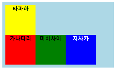
wrap는 감싸는 크기를 벗어날 때 다음 줄로 넘겨 내용물을 보인다.
wrap-reverse는 위와 같이 밑에서부터 순서대로 위로 올린다.
flex-flow: ~~;
flex-flow는 direction과 wrap을 동시에 작성하는 속성이다.
flex-direction: row;
flex-wrap: wrap;


flex-flow: row wrap;
한 줄로 두개의 기능을 작성할 수 있다.
내일은 align-items / justify-content / align-content / flex-basis / flex-grow / flex-shrink / flex / align-self / order / z-index
이렇게 알아볼 예정이다.
https://studiomeal.com/archives/197
이번에야말로 CSS Flex를 익혀보자
studiomeal.com
이전에 display: flex와 관련하여 많이 헷갈렸었는데 시간이 날 때마다 아래의 사이트에서 연습했던 것으로 기억한다.
갈수록 어렵기도하고 이런 방법도 있구나 하면서 사용하는 법을 익혔었다.
게임형식이지만 뭐 그렇게까지 재미는ㅋㅋ...
게임의 규칙은 해당 스테이지의 모든 개구리를 flex와 관련된 속성으로 이동시켜서 연잎에 도달하게 하는 것이다.
Flexbox Froggy
A game for learning CSS flexbox
flexboxfroggy.com
위 개구리 게임과 비슷한 형식이다.
flex의 속성들을 사용하여 포탑을 이동시키고 웨이브를 막는 게임이다.
이것도 뭐 재미는 없지만, 앞선 게임과 동일하게 속성의 다양한 요소들을 사용할 수 있어 도움은 된다.
플레이 하기 전에 웹사이트의 볼륨을 줄이는 것을 추천한다.
http://www.flexboxdefense.com/
Flexbox Defense
Your job is to stop the incoming enemies from getting past your defenses. Unlike other tower defense games, you must position your towers using CSS!
www.flexboxdefense.com
'2차 공부 > TIL' 카테고리의 다른 글
| 24.05.30 TDZ와 Hoisting, var let const (0) | 2024.05.30 |
|---|---|
| 24.05.29 display: flex (2) (0) | 2024.05.29 |
| 24.05.27 React 트랙을 신청한 이유 (0) | 2024.05.27 |
| Prop Drilling이란? (0) | 2024.05.14 |
| JSX에서 지켜야 할 5가지 (0) | 2024.05.14 |